

9. Becoming Risk Savvy
An Educated Citizenship

In April 2020, remembering the mistakes of the Swine Flu panic, I felt a growing sense of unease about the potential for unintended harm arising from the response to the Covid-19 pandemic. Harm to society could eventuate if people were unable to accurately assess absolute risks from the virus. Real world examples suggested that we may be inappropriately generalising estimations of risk.
The UK Govt Chief Scientific Advisers had initially adopted a calm and reassuring attitude, which was in keeping with the pre-existing national pandemic strategy. On 30th April 2020, The UK’s Chief Medical Officer, Chris Whitty, delivered a presentation informing his academic audience,
‘At an individual level the chances of dying of coronavirus are low. Over the whole epidemic, even if there is no vaccine, a high proportion will not get it. Of those who do, a significant proportion (exact number not yet clear) have no symptoms. Of the symptomatic cases, the great majority (around 80%) a mild- moderate disease. A minority have to go to hospital, most need only oxygen. The great majority of these survive. A minority of those need ventilation. A minority of every age group sadly die with current treatment, but even of the oldest group most do not’.
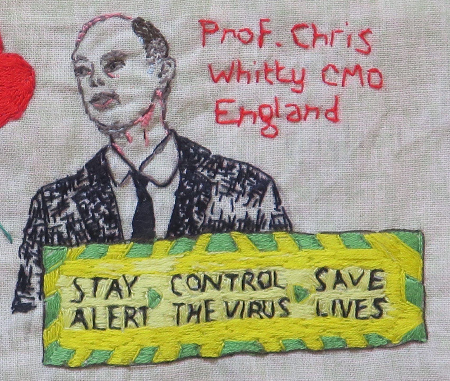
It is interesting that the UK’s CMO chose to communicate risk with such measured honesty for his academic audience. This jarred with the tone of the UK government health messaging at that time, which warned the general public, "Anyone can get it. Anyone can spread it” and "If you go out, you can spread it. People will die”.

In the face of such over-simplified, hard-hitting emotional messaging, it was hard to avoid developing a distorted risk-perception.

It has always been part of our role as doctors to understand and contextualise risk for individuals. However, as Gerd Gigerenzer explains in his book Risk Savvy, this is not always done well. In a monograph entitled ‘Helping Doctors and Patients Make Sense of Health Statistics’, his team describe the widespread ‘statistical illiteracy’ (inability to understand the meaning of numbers) common to patients, physicians, journalists and politicians. Regardless of whether non-transparent framing of information is unintentional (arising due to a lack of understanding of the statistics) or intentional (an effort to persuade or manipulate people), the consequences for health can be serious.
They make a number of recommendations for promoting statistical literacy, which I believe are pertinent to Covid-19 risk communication:
Statistical literacy is a necessary precondition for an educated citizenship in a technological democracy. Understanding risks and asking critical questions can also shape the emotional climate in a society so that hopes and anxieties are no longer as easily manipulated from outside and citizens can develop a better-informed and more relaxed attitude toward their health.
The causes of statistical illiteracy should not be attributed to cognitive biases alone, but to the emotional nature of the doctor–patient relationship and conflicts of interest in the healthcare system.
Without understanding the numbers involved, the public is susceptible to political and commercial manipulation of their anxieties and hopes, which undermines the goals of informed consent and shared decision making.
A major precondition for statistical literacy is transparent risk communication.


They call for psychological research on transparent visual and numerical forms of risk communication, as well as training of physicians in their use, and recommend:
Using frequency statements (eg ‘Out of every 10 of my patients who take Prozac, 3 to 5 experience a sexual problem’) instead of single-event probabilities (eg ‘If you take Prozac, the probability that you will experience sexual problems is 30% to 50%’).
Using mortality rates (eg ‘There are 26 prostate cancer deaths per 100,000 American men vs. 27 per 100,000 men in Britain.’) instead of survival rates (eg ‘The 5-year survival rate for people diagnosed with prostate cancer is 98% in the USA vs. 71% in Britain.”).
Both of these statements about prostate cancer are simultaneously true. To understand why, we need to look at how clinicians in America and Britain test for prostate cancer. If America has a lower threshold for prostate cancer screening, they will screen for, and detect, a higher proportion of clinically indolent prostate cancers, and cancers at an earlier stage. Even if early detection through screening doesn’t translate into improved mortality, the 5 year-survival rates for prostate cancer cases will still look better, because the screening is picking up less aggressive prostate cancers and at an earlier stage, diluting the pool of overall cases. (This is one reason that the UK has not yet introduced general screening for prostate cancer, though that may change if tests improve, or if early population screening is shown to improve clinical outcomes).
Presenting natural frequencies (eg Ten out of every 1,000 women have breast cancer; Of these 10 women with breast cancer, 9 test positive; Of the 990 women without cancer, about 89 nevertheless test positive; In other words, for every 1000 women screened for breast cancer, 98 will test positive, and of these 98 women who test positive for cancer, 9 will have breast cancer but 89 will not have cancer) instead of conditional probabilities (eg The probability that a woman has breast cancer is 1% (prevalence); If a woman has breast cancer, the probability that she tests positive is 90% (sensitivity); If a woman does not have breast cancer, the probability that she nevertheless tests positive is 9% (false-positive rate).
Presenting absolute risks (eg ‘Mammography screening reduces the risk of dying from breast cancer by about 1 in 1,000, from about 5 in 1,000 to about 4 in 1,000’) instead of relative risks (eg ‘Mammography screening reduces the risk of dying from breast cancer by about 20%.’).
An Educated Citizenship
Though some have attempted to further the cause of statistical literacy in the Covid Pandemic, it has been instructive to observe the backlash this can provoke from some quarters. There appears to have been a paternalistic assumption that a naive and gullible lay public are particularly susceptible to being misled, that they can’t be trusted to understand nuance and weigh risks appropriately, and so should be shielded from ‘complex’ information that might lead them to make the ‘wrong’ choices.
In risk communication, it is often easier to ignore complexity for the sake of clear uniform public health messaging. In the long term this may backfire, however, when people come to believe that they have been misled or manipulated by the official public health messengers. The public can feel unjustly denied the disclosures that might have led them to make different individual choices at the time, or even the same choices but under conditions of more freedom of the information which they had a right to access.
Anchoring
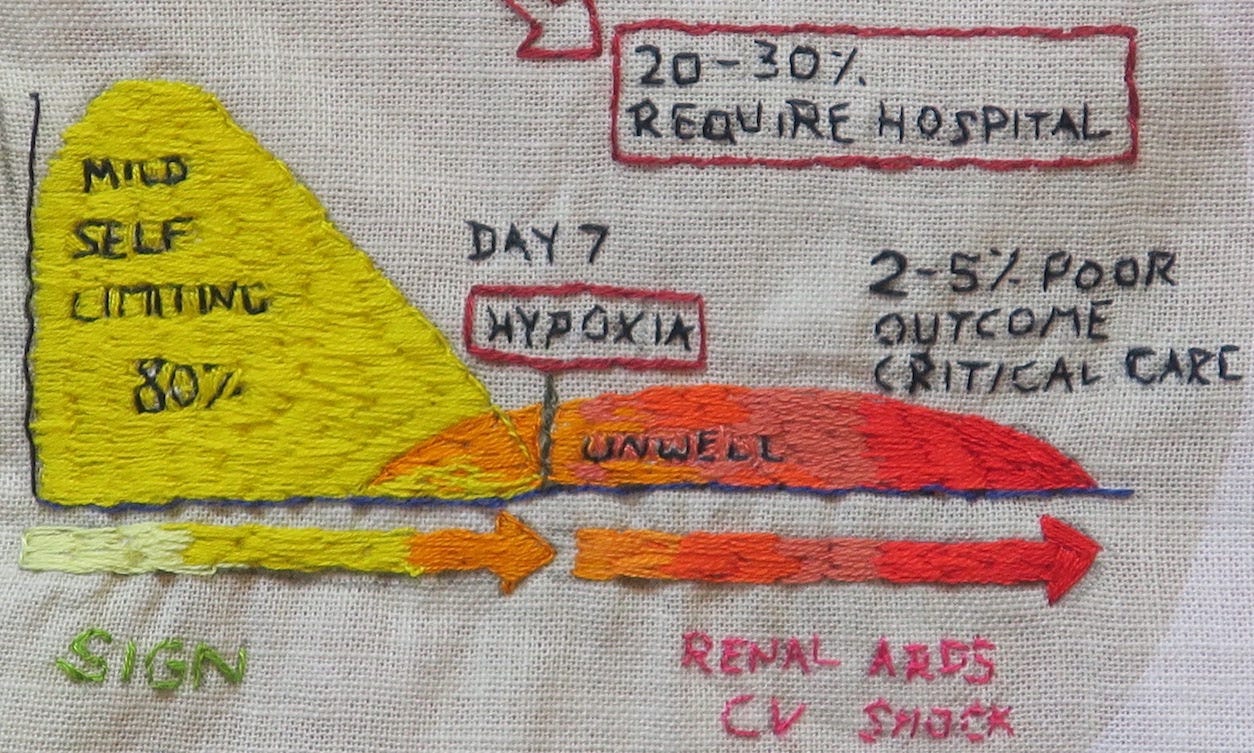
At the beginning of the pandemic, every NHS clinical update about Covid seemed to be prefaced with a visual reminder that Covid-19 is a disease with a 20-30% hospitalisation rate and 2-5% poor outcome, requiring critical care. These early high estimates should have been revised down, when real-world national data in Spring 2020 showed them to be inaccurate.
Is it possible that healthcare professionals, through repeated exposure to to these same high estimates, were thereby subject to anchoring bias when assessing risk? In some medical circles, it became oddly taboo to openly discuss revised estimates, as though those at lower risk (a sizeable chunk of the population) would engage in reckless and risky behaviour if they understood their own risk to be low. Worse, by quoting lower fatality rates, we were somehow symbolically disrespecting those who had suffered severe outcomes.
The Covid-19 Hospitalisation Rate (ratio of ‘confirmed Covid-19 ‘Hospitalisations’’ to ‘confirmed Covid-19 ‘Cases’’) depends on:
The definition of a ‘Case’ (see post 7. A Case of Covid), which changed over time.
The testing strategy: who is tested (asymptomatic v mildy symptomatic people v people with more severe symptoms) and population testing rates.
The definition of a ‘Hospitalisation’: Early on in the pandemic, infections acquired in UK hospitals were being misinterpreted as infections severe enough to require hospitalisation.
In August 2020, the Scottish Government Working Group defended the 20-30% hospitalisation figure, quoting the ECDC (European Centre for Disease Control) report from that month, which gave a 28% hospitalisation rate for reported cases in the EU/EAA and UK, with 24% of hospitalised cases in the EU and UK having died (country range 0-38%).
These ECDC quoted figures bore little relevance for our population, given the inconsistencies between countries in terms of testing strategies, hospitalisation rates and case definitions. Moreover, as population-level statistics, the ECDC figures didn’t look plausible. A 20-30% hospitalisation rate across all ages just didn’t fit with what we were seeing locally. I calculated the UK pre-vaccination hospitalisation rate for swab positive patients after the ‘Delta wave’ to be somewhere between 6% and 10%, which may still be an overestimate.
So why were the ECDC figures so unrepresentative of what was happening on the ground?
The early UK strategy of targeting testing to those sick enough to potentially need hospitalisation, or to patients already in hospital, made ‘hospitalisation rates’ appear artificially high in the first wave. Other countries, like Denmark and Italy, screened more people, had fewer tests per ‘case’ and lower hospitalisations per ‘case’.

In looking at the Our World in Data statistics from a sample of European countries and the UK, we can observe the impact different testing strategies and case definitions had on ‘Hospitalisation’ and ‘Case Fatality’ Rates in the first and second waves.
Weekly UK testing rates at the peak of the April ‘first wave’ were low (test positivity 26%, or 3.8 tests per ‘case’ on 7 April 2020), then testing increased once infections had declined (test positivity 17% by 27 April 2020).

Case hospitalisation rates supposedly ranged from 4% (Denmark, August 2020) to 54% (UK, April 2020). The UK hospitalisation rate apparently dropped to 7% at the peak of the second wave in January 2021. Nevertheless, the absolute numbers for UK ‘Covid-19 hospitalisations’ were seemingly higher in the second wave.

The same ‘Our World in Data’ sources generate equally implausible ‘Case Fatality Rates’ (the ratio between confirmed deaths and confirmed cases); in our sample, these range from 0.84% (Denmark, Jan 2021) to 21.88% (UK, April 2020).
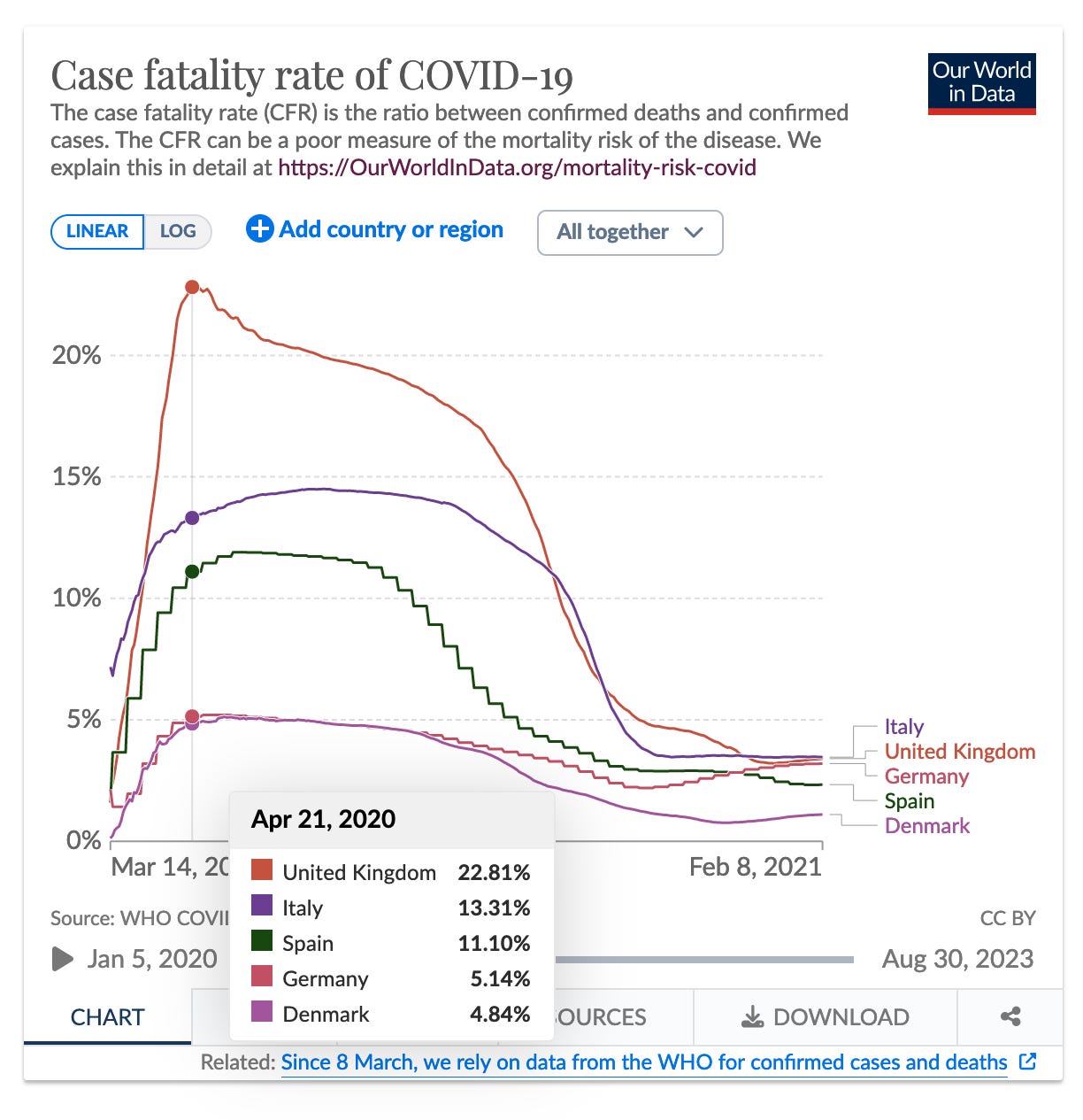
Here, Our World in Data provide a helpful warning,
‘the CFR ‘is the ratio between the number of confirmed deaths from the disease and the number of confirmed cases, not total cases. That means that it is not the same as – and, in fast-moving situations like COVID-19, probably not even very close to – the true risk for an infected person.’
It would have been helpful for the SIGN infographic to have had a similar warning footnote, explaining that it is supposed to represent ‘the ratio between the number of confirmed hospitalisations from the disease and the number of confirmed cases, not total cases’ and that it is ‘not the same as – and, in fast-moving situations like COVID-19, probably not even very close to – the true hospitalisaton risk for an infected person.’
For the SIGN ‘20-30% hospitalisation rate’ to be correct, there would need to have been about 2.5 million fewer ‘cases’ than reported, or a 70-80% asymptomatic/false positive rate. Yet the graph remained unchanged, embedded in national guidelines as late as 2022. How could that same statistical information, based on April 2020 Wuhan data, be reliable and relevant for over 2 years, with a changing definition and testing strategy?
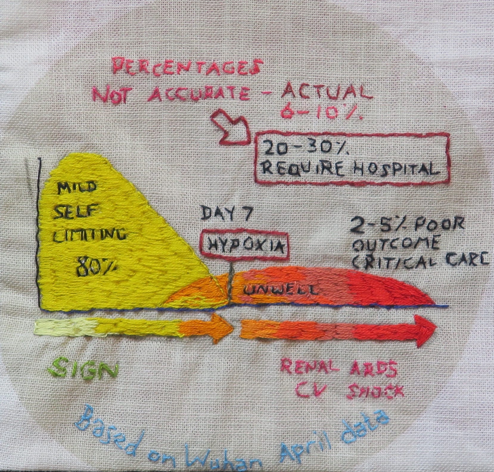
Unfortunately, the Scottish Government Working Group chose not to amend this misleading infographic, when given opportunity to do so, in August 2020. Not only did they miss an opportunity to present more accurate contemporaneous risk rates, they also opted not to caveat the figures, for their target audience. Whether this non-transparent framing of information was unintentional or intentional, the consequences for health were potentially serious. We can debate the intentions behind the actions of communicators, but what matters, in terms of responsibility, is the consequences of their professional communications.
People tend to perceive claims as truer if they have been exposed to them before, known as the illusory truth effect. The same NHS staff responsible for communicating risk to patients were being told that 20-30% of all people with this highly infectious virus would need hospitalisation and, of these people, up to 1 in 20 would require critical care or die. No wonder some people were so fearful of just going to work, never mind the actual possibility of passing Covid-19 infection to a patient.

Obviously, it isn't all about mortality. With severe Covid infection, we see post-Covid morbidity and loss of functional reserve. Post-Covid syndrome can, for some, be life-changing, with uncertainty about the prognosis for recovery. Nevertheless, if the hospitalisation and mortality risks were being misrepresented so far into the pandemic, what bearing does that have for accurate statistics on other Covid parameters, including post-Covid syndrome?
I’m still working my way through your posts and rather in awe at the amount of research you’ve done and your skill in interpreting it and making it easy to understand. I’m vexed that this vital work isn’t more widely read. Therein lies the rub.
Such a great project!