


10. Number Theatre
The First Pillar of Statistics is Trustworthiness

From the point at which it became clear to us that Covid-19 was unavoidable, we needed to know how to contextualise the risk it represented, not only for our patients and staff, but also for our own families. Though a wealth of data was available, it was surprisingly difficult to access the crucial tools needed to have useful discussions about the absolute risk posed by the virus, on an individual and population level, tailored to age, frailty, co-morbidities and other vulnerabilities. In order to make informed decisions, people need to have easy access to this sort of information, and in a format they can understand.
It was very clear to those of us in direct daily communication with the public, that Covid-19 risk perception was generally skewed and impoverished. In July 2020 a Kekst CNS Coronavirus Tracker survey suggested that people in Scotland massively overestimated the deadliness of Covid-19. In answer to the question, 'Which percentage of the population in Great Britain do you think have died from coronavirus?', the mean answer was 10.23%, a figure 85-100 times higher than the number of Covid-attributed UK deaths in 2020. This was flagged as misleading, but the median answer was 1% which was still 10 times higher than the actual number.
Similarly, a Franklin Templeton-Gallup survey showed Americans dramatically misunderstood the risk of dying from Covid-19. Respondents estimated that people aged 44 or younger accounted for 30% of U.S. Covid-19 deaths, when the actual figure for that age group was 2.7%. They thought people aged 65 or older accounted for roughly 40% of Covid-19 deaths, when the actual figure was 80%. While people aged 18 to 24 accounted for 0.1% of overall Covid-19 deaths, about 59% of respondents in that age bracket said they feared significant health consequences if they contracted the virus. Even now, some low risk people hold on to the belief that if they had contracted Covid-19 before vaccinations, they would almost certainly have died.

Fatality Rates
Fatality rates can help us understand the severity of a disease in comparison to other historical outbreaks and help identify at-risk populations. The Case Fatality Rate (CFR) estimates the proportion of deaths among identified confirmed cases, whereas the Infection Fatality Rate (IFR) estimates the proportion of deaths among all infected individuals. The IFR should be lower than the CFR as it includes not only detected cases, but also those with undetected disease (asymptomatic and untested cases).
Single measures (that pool all those at risk) of population IFR and CFR are unhelpful, failing to account for heterogeneities between different age and risk groups. In March 2020, the WHO had predicted a high CFR of 3-5%. The NHS was galvanised into action (thus inaction regarding non-Covid), by Italian reports of 14-20% hospitalisation and 2-5% Case Fatality rates, with regular reminders of how unfavourably this compared with the relatively low CFR of 0.1% for seasonal ‘flu. At the same time, UK government advisers at SAGE were predicting a CFR of 5% and IFR of 0.5-1%!
Estimating CFR and IFR in the early stage of a pandemic is subject to considerable uncertainty. At the start of an outbreak, those tested and confirmed as cases tend to be patients with more severe symptoms. Milder cases are less likely to be detected, leading to overestimation of CFR. China provides the perfect illustration, where the CFR between 1st and 10th January was as high as 17%. As a pandemic evolves, estimates of CFR and IFR usually fall, even in the absence of a change in virulence of disease. In the 2009 Swine flu pandemic, early CFR estimates ranged between 0.1% and 5.1%, but the figure was later revised down by the WHO to 0.02%.
CFR varies over time, partly an artefact of testing behaviour, but also partly due to factors such as seasonality, dominant variant and pressures on the healthcare system. The IFR across countries may vary substantially, with older national populations having a higher IFR. Different approaches to defining COVID-19 cases, infections and deaths, makes it difficult to compare rates between nations.
Even within a single country, changing definitions can affect calculations.
Traditionally, when we talked of ‘cases’, we would generally be referring to people with symptoms. With new widespread testing, we broke that established tradition. By August 2020 in the UK, a Covid-19 ‘case’ equated to a positive PCR swab, so in effect, the CFR would now approximate the IFR and cases now also included asymptomatic infections, false positives and post-infectious positives. The more intense the national swabbing protocols, the greater the number of ‘asymptomatic’ positives and the lower the potential CFR/IFR, but also the more difficult to make sense of the accumulating data.
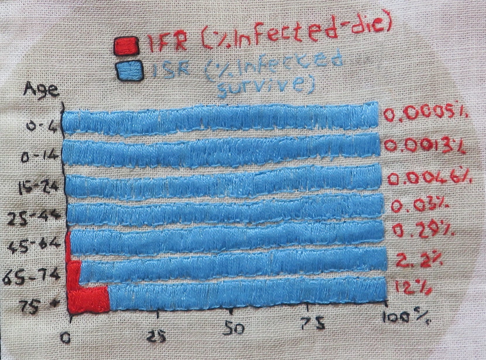
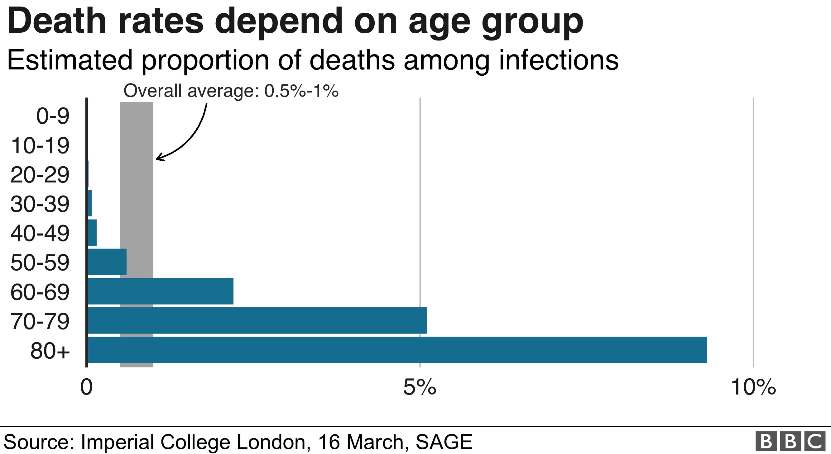
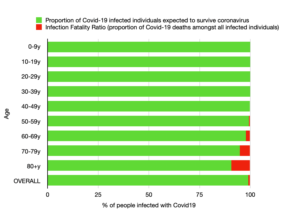
To effectively communicate risk, we needed risk-group-specific estimates of fatality. As early as March 2020, we knew there to be a strong risk gradient by age, frailty and underlying health. The BBC did share this detail early on, but visually presented the data in a way that made the situation look far worse, by ending the fatality ratio axis at 10% instead of 100%.
The same information can be visually presented in a different way, as I have attempted to show below:
These March 2020 IFR estimates, derived primarily from Chinese data and published by Verity et al, formed the basis of Imperial College London’s Report 9 and their modelled prediction of 510,000 UK Covid-19 deaths in an unmitigated pandemic:
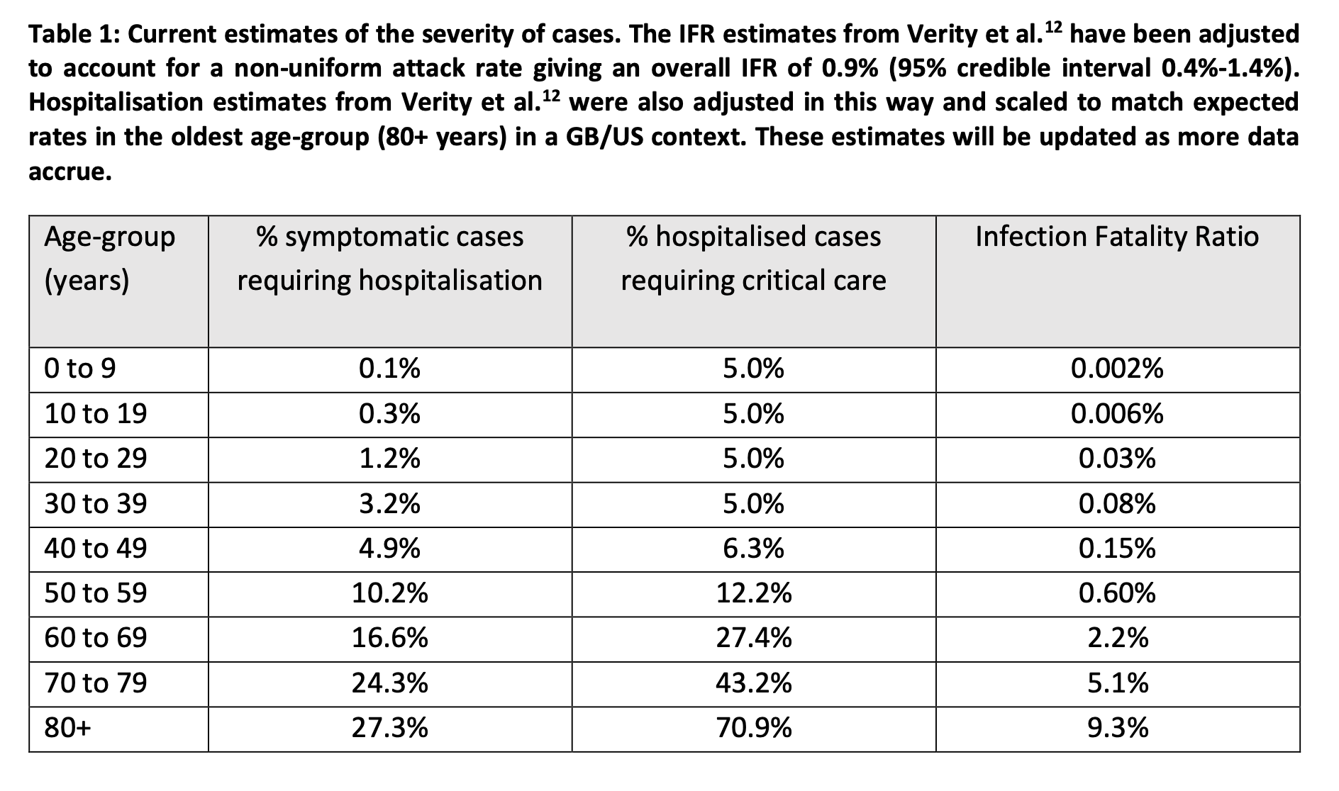
Interestingly, the same Imperial College table also suggests Covid-19 hospitalisation rates below 20% for all age-groups under 70y of age. This clearly contrasts with the 20-30% hospitalisation estimate featured on the SIGN Covid-19 infographic, a risk communication tool that was being shared widely in the NHS, and that would consequently strongly influence perceptions of risk amongst healthcare workers.
Tools for Transparent Risk Communication
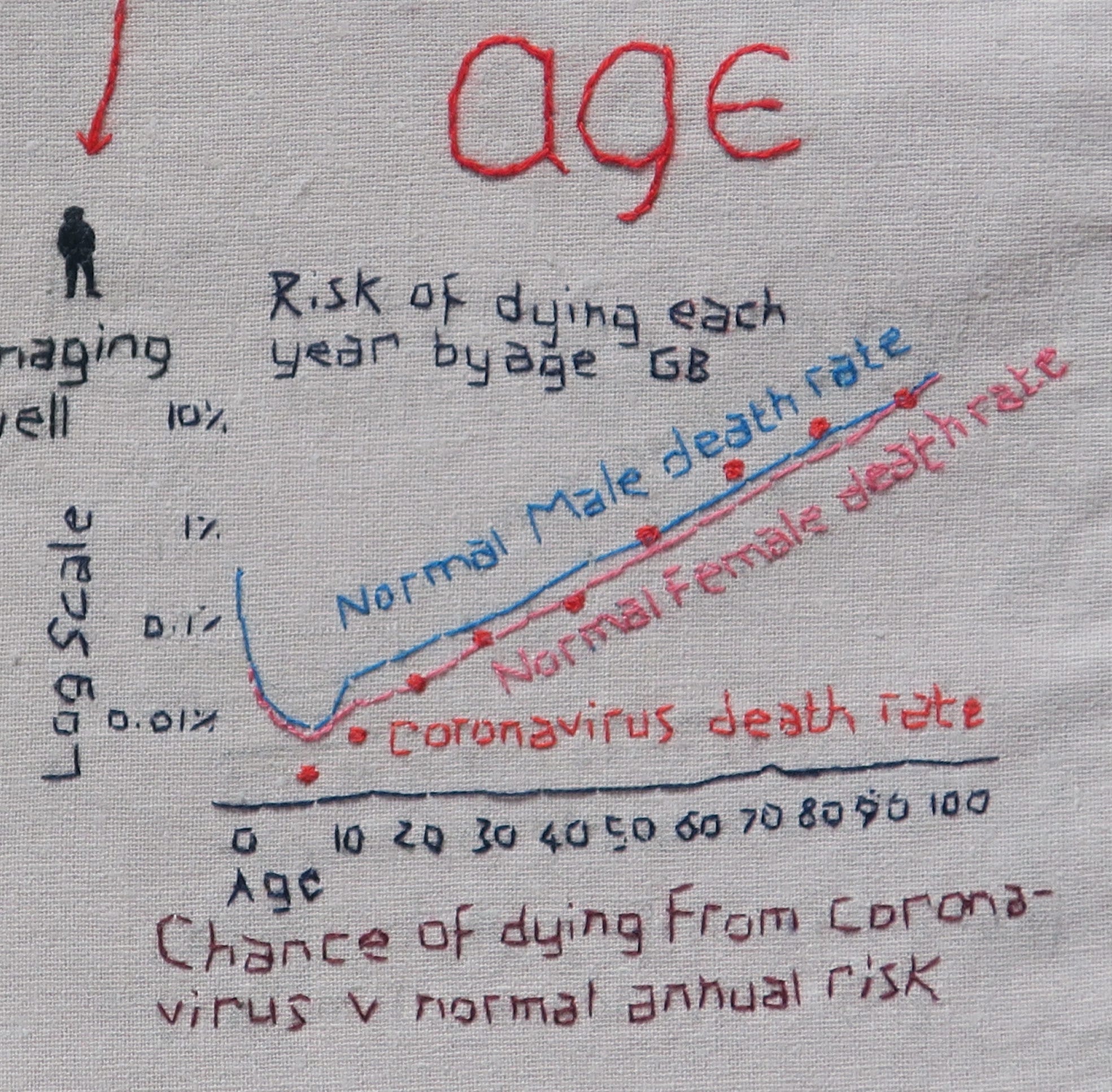
Risk expressed visually and as natural frequencies is easier to understand than probabilistic interpretation of risk. I could not find any natural frequency graphical representations of Covid-19 mortality risk, so created my own in May 2020, based on Imperial College data. Colleagues expressed surprise to see the low absolute mortality risks for the under 60s:

Spiegelhalter
One person eminently qualified to communicate the Covid-19 risk and uncertainty, is British statistician, Professor David Spiegelhalter. As ‘Winton Professor of The Understanding of Risk’, he didn’t just dabble in risk communication, it was his life’s work. Speaking about the challenges of communicating during the epidemic, he maintains the importance of trustworthiness as the ‘first pillar’ of the Code of Practice for Statistics, which must include admitting uncertainty, presenting data impartially and objectively, and acknowledging limitations in the quality of evidence.
In 2020, Spiegelhalter spoke critically about what he described as the untrustworthy ‘number theatre’ of Covid-19 statistics. He considered the ‘league tables’ (of cases/deaths) to be ‘ridiculous and pointless’, and Neil Ferguson’s ‘half a million if we did nothing’ was ‘never going to happen’. Affronted by media manipulation of statistics, he believed risk should be preferentially communicated by people who ‘know the strengths and limitations of data’ and ‘treat their audience with respect’.
To his credit, early in the pandemic, he attempted to convey through the mainstream and medical media, the ‘extraordinary’ age gradient of Covid-19 mortality. In his influential BMJ paper, ‘Use of “normal” risk to improve understanding of dangers of covid-19’, he made two key observations:
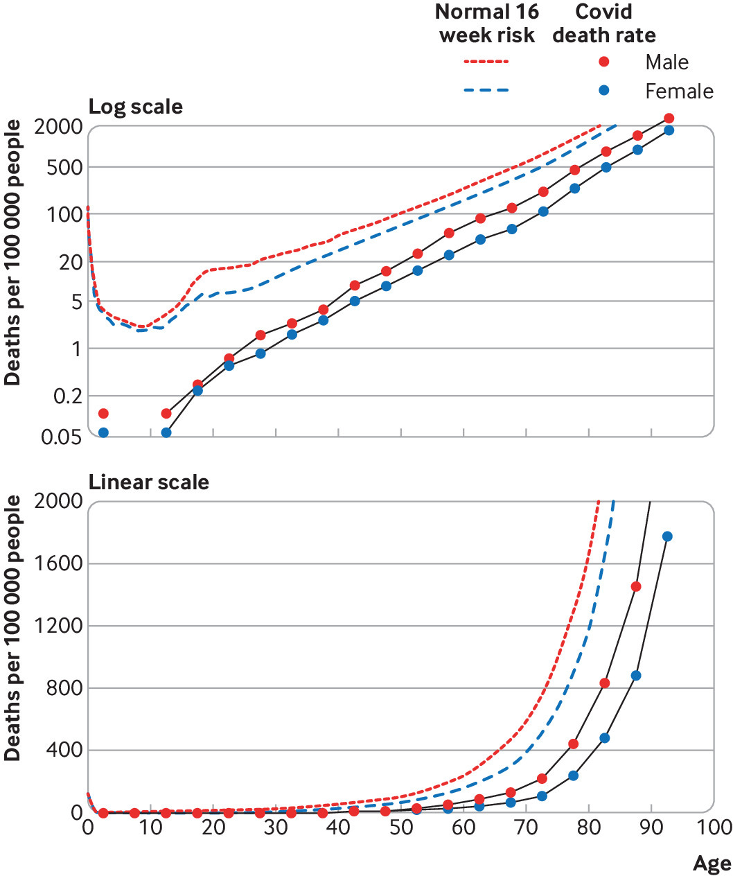
Population fatality risks in terms of normal risks: Covid-19 death rates increased exponentially with age, with the rate of dying roughly 12-13% higher for each extra year of age. For the general population, the risk of catching and then dying from covid-19, during 16 weeks of the pandemic, was equivalent to experiencing around 5 weeks extra “normal” risk for those over 55, decreasing steadily with age, to just 2 extra days for schoolchildren. Describing this as a ‘remarkable finding’ and one that should have been given much wider coverage, he stated, ‘there is simply nothing else that gives a 10,000-fold mortality difference across the ages in this way’, meaning that Covid dying is very similar to normal dying, for populations.

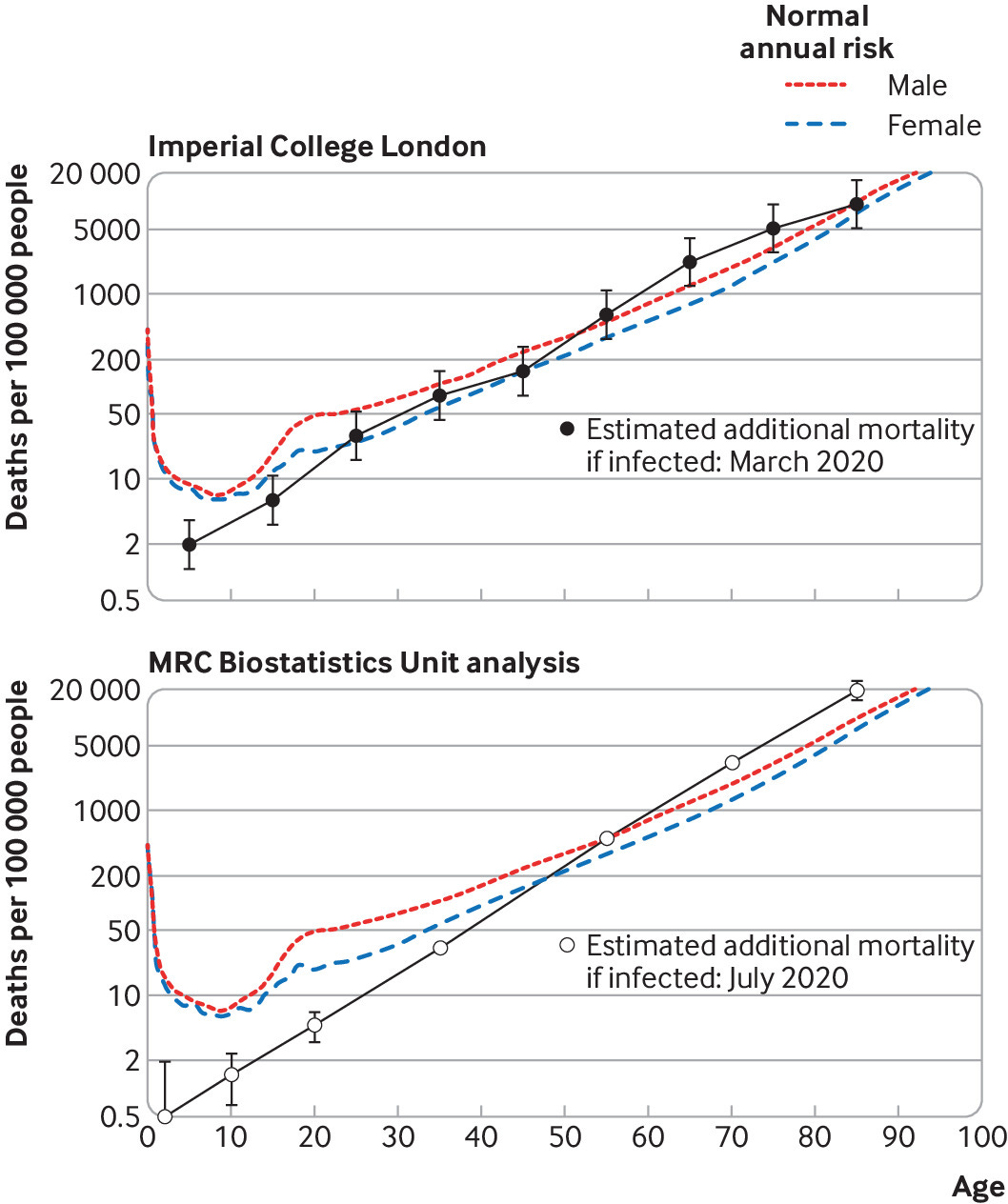
Observed population fatality rates for 49 607 deaths mentioning covid-19, registered in England and Wales between 7 March and 26 June 2020. The covid-19 death rates create a remarkably straight line on a logarithmic scale (top), indicating an exponential increase of risk with age. The “normal” risk (dashed lines) is the actuarial annual mortality, scaled by a factor 16/52 to reflect the risk over 16 weeks. (Spiegelhalter BMJ 2020;370:m3259) Infection fatality risks in terms of normal risks: The Imperial college Covid IFRs were close to the normal annual actuarial risk of dying, a demonstration of the ‘extraordinary’ effect of age on Covid-19 mortality. For those over 55y infected with Covid-19, the additional risk of dying is slightly more than the “normal” risk of death from all other causes over one year, and less for under 55s. For healthy under 50s the absolute and relative risk is very low, and for under 45s the risk well below the risk of dying by accident. The risk to children was always minute and lower than the normal risk they face.

Estimated infection fatality rates with covid-19 superimposed on background annual risk. Top: estimated covid-19 infection fatality rates are from Imperial College London, March 2020. Error bars on the estimated age specific covid-19 mortality assume a relative error of ±55%. Bottom: estimated covid-19 infection fatality rates from MRC Biostatistics Unit analysis, July 2020. (Spiegelhalter BMJ 2020;370:m3259)
These are average risks, whereas 80-90% of people who die from Covid-19 have pre-existing medical conditions. In all age groups, men have double the risk of women at the same age. Essentially Covid-19 takes advantage of the pre-existing frailties. The greatest risk of dying from Covid-19 is conferred on those already at greatest risk of dying.
Spiegelhalter attempted to communicate Covid-19 mortality risk in terms of ‘equivalent days of normal risk’, but wasn’t happy when some people didn’t realise that this risk was in addition to the normal risk of dying. But for those with a low ‘actuarial’ risk of dying, even double the normal risk of dying remains a low risk of dying for them.
He seemed unprepared for the consequences of speaking openly, honestly and impartially about risk, in what had rapidly become a polarised political atmosphere surrounding discourse on Covid-19 risk and policy. He felt his graphs weren’t universally well understood, were open to misinterpretation, or were used in bad faith by people pushing a particular agenda. He describes feeling used and manipulated, and didn’t relish being the focus of media attention in this way.
But does this adequately explain his discomfiture? He wanted to remain ‘non-aligned’, but the lockdown stakes were so high that this was always going to be impossible. He had given people a tool to contextualise risk, but this tool threatened to undermine the government’s behavioural ‘nudge’ strategy, whereby ‘the perceived level of personal threat needed to be increased' across the board. Though he always stood by the numbers, (which, as he points out, have no strong agendas), it seems as though he came to regret his decision to speak out in the way he did. After this, he appeared to play it safe, self-censor and avoid controversy, though would still, on occasion, speak up about the more egregious errors in data interpretation and risk communication.
Heneghan and Oke
There were others who demonstrated scientific fidelity in their risk communication, notably members of the CEBM team. Several weeks into the pandemic, Heneghan and Oke began comparing global CFR estimates. It was apparent that the WHO’s initial single estimate fatality rates were inaccurate, even if we factored in differences between populations. By August, they could see that the UK with a CFR of 6.57% was a clear outlier compared with the rest of Europe - even Italy had revised their figure down to 2.38%. This difference could only be explained by a difference in the way UK deaths were being recorded and reported, compared with our European counterparts. Following the publication of more accurate statistics by PHE, they were able to show that the CFR in England stood at around 1.5% with overall IFR 0.30% using the MRC unit’s data and 0.49% using ONS data.

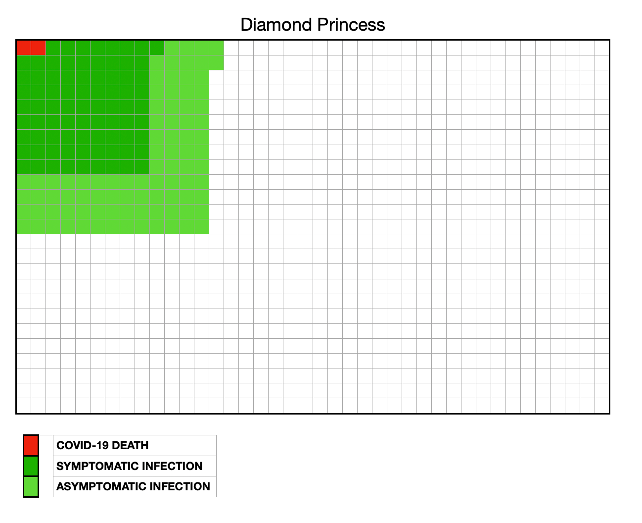
On the Diamond Princess Cruise Ship, a ‘closed’ population of quarantined passengers were tested. The IFR was 1.2% (CFR 2.3%), despite this being a largely elderly population.
At the other extreme, on the USS Theodore Roosevelt, of 4500 sailors, 1156 tested positive (infections), and of these 693 (60%) were allegedly asymptomatic. Of those with symptoms, 7 were hospitalised, of whom one died and one other went to ITU. The absolute risk of death was low (0.2 per 1000).

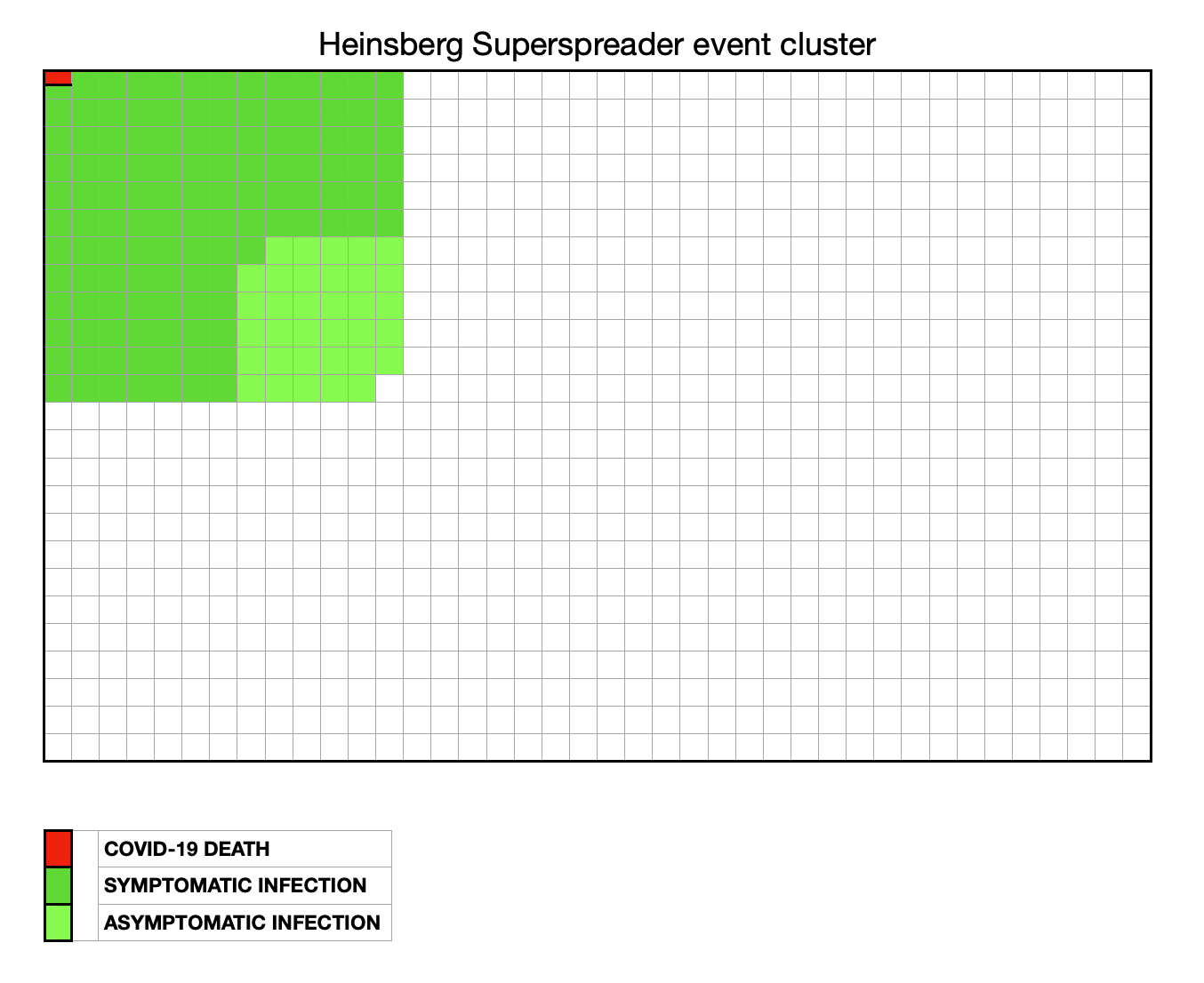
In the German town of Heinsberg there was an outbreak following a carnival. 15.5% of people attending the carnival were infected and 22% of infections were asymptomatic. The adjusted IFR was estimated to be 0.36% (0.29-0.45%) (0.55 deaths per 1000 population at risk).
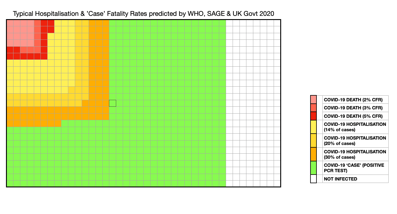
Contrast these real-world examples, with the infection, hospitalisation and fatality rates presented to us by the WHO, SAGE and UK Government in 2020; statistics which were rarely updated even as more accurate data emerged. I have attempted to visually represent some of the typical quoted rates to show how they compare to real-world examples. It is not hard to see why many people came to distrust these official sources:
Ioannidis
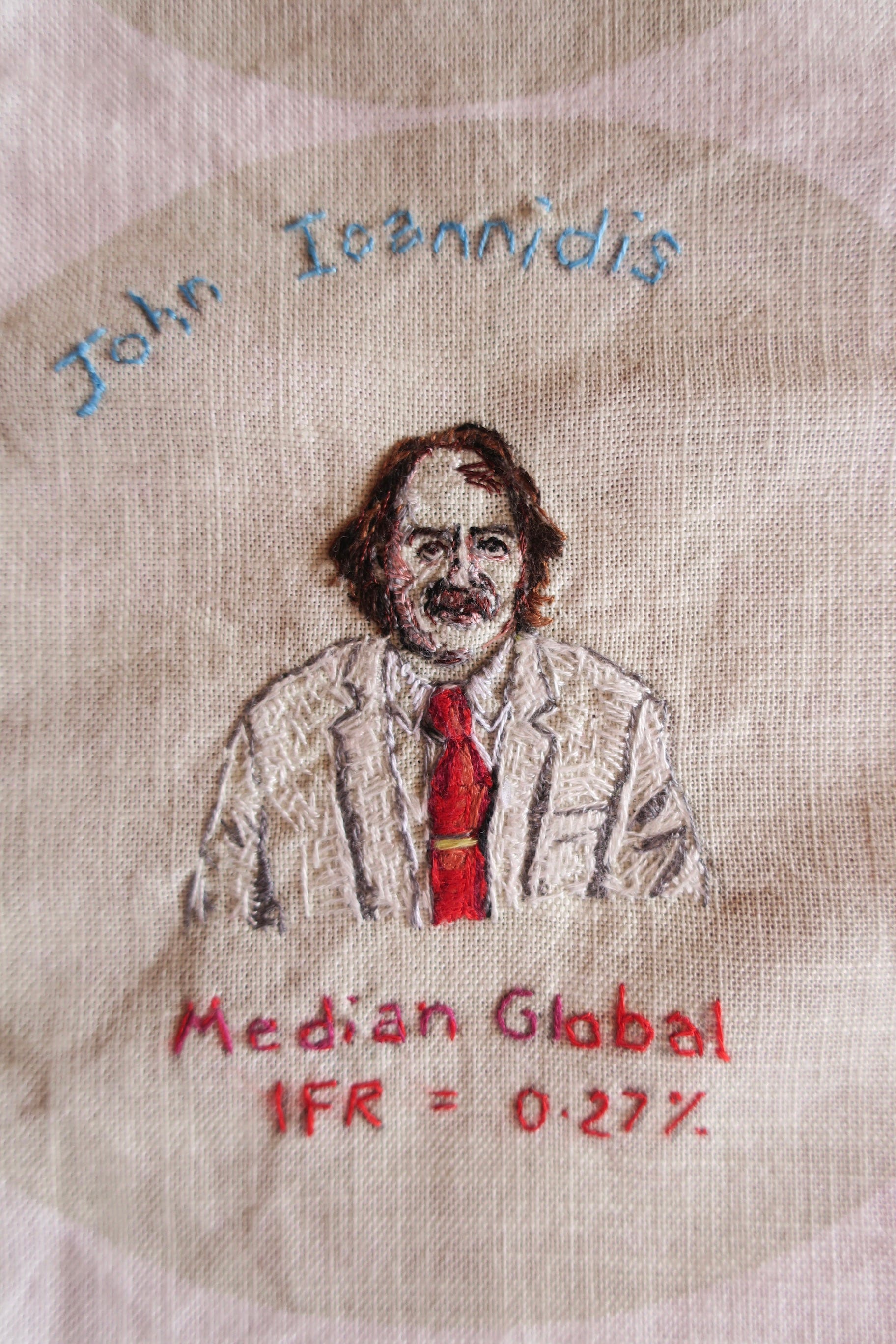
In October 2022, Stanford researchers, Ioannidis et al presented pre-vaccination age-stratified IFRs for Covid-19 using seroprevalence data. They found a median IFR of 0.0003% at 0-19 years, 0.003% at 20-29 years, 0.011% at 30-39 years, 0.035% at 40-49 years, 0.129% at 50-59 years, and 0.501% at 60-69 years. At a global level, pre-vaccination IFR may have been as low as 0.03% and 0.07% for 0-59 and 0-69 year old people, respectively, which was much lower than earlier estimates. For under 35s the mortality risk from Covid-19 appeared lower than seasonal ‘flu.
In a 2022 article, Heneghan, Jefferson and Oke pointed out the more than 10-fold discrepancy between Imperial College’s early IFR estimates and Stanford’s seroprevalence studies. In their words,
’The consequences of overestimating the IFR are profound. It overpredicts the number of deaths and influences political decision-making without considering the long-term harm and well-being effects.’
They conclude,
‘Invoking the precautionary principle for the widespread use of restrictions based on catastrophic predictions also underlines the misunderstanding of the basis of the principle: act only when you are sure that the benefits of your actions outweigh the negative consequences. No such evidence existed then, as lockdowns were not even contemplated in the existing pandemic plans.’
It is hard to imagine we would have made the same pandemic decisions if this had been more openly discussed.
Great graphs. Interesting how you note (was it here or previously?) that people are swayed by experience. “Two of my friends’ dads died of Covid’ is one I have heard from another medic, without any acknowledgment that one had late stage dementia and the other had been battling cancer and defying the odds for years. Not to mention the fact that when you reach your late 40s/50s an increased proportion of your friend’s parents start dying, often in seasonal clusters.